Reducing e-commerce abandonment rates with improved browsing and discoverability for the online giant

mans sitting using amazon on laptop with his dog

Date Completed

August, 2018

Overview

Twenty-three percent of online shoppers visit Amazon for inspiration without a specific product in mind for purchase. However, Amazon provides little support for browsing by category. Menus of ambiguous categories often provide a literal discovery experience that can lead users to unexpected and interesting buys they may not have otherwise considered.

With high abandonment rates and more than a quarter of hundreds of millions of users intent on browsing, even minor improvements in discoverability can have significant impacts.

To arrive at a user feedback based solution for improved category browsing I worked through a complete user centered process including in-person task based usability testing of Amazon.com. Having confirmed the need for a category based browsing solution, an interactive prototype was developed to offer users a simplified and more familiar interface.

I acted as a UX team of one for this research while also consulting with other UX professionals in my network when considering the topic of discoverability, search and browsing in e-commerce.

Process

learn

The first step in the redesign of Amazon's interface was to learn about their business objectives, and users

Business model analysis

Amazon.com has achieved a conversion rate of 13% which is almost seven times the industry average for ecommerce. Prime members buy an average of $1,400 a year worth of goods at a total number of 103 million as of March of 2019. Regular customers spend $600 per year with the most recent data showing their numbers at 310 million according to Statistica. This makes even small improvements in search abandonment rates far from insignificant. 

Prime Members convert at %47 vs %13. A one percent increase in prime member annual spend would be $140 a year, at one million customers is $14 billion in additional sales per year. For non-prime members, it works out to $1.8 billion for a total of $15.8 billion per year.

Amazon prime sign-ups have slowed since their 2016 peak. As the correspondence between shopping preferences and prime benefits begins to plateau, improvements in user experience become more central to continued efforts to drive growth in prime subscriptions and the windfall difference in annual sales for each membership.

Amazon year over year profits info graphic
Business objectives

Optimizing search is optimizing conversions. In 2017 Amazon became the primary search engine for product searches surpassing google. While selling products in every conceivable category is Amazon’s core strategy, the current site offers unfamiliar patterns and affordances for browsing. Browse Abandonment Rates Are As High As %75 of all visits.

Amazon abandonment rates
understand

Knowing that Amazon’s UX is search-driven, I planned and conducted research to improve the balance between search and discovery

Heuristics review

Great e-commerce search and discovery includes powerful and intuitive browsing experiences that can easily work without the search bar. Netflix, for example, is entirely discovery-based.

Amazon has gone a different direction. Their solution for discovery is implemented as predictive search in a way that mixes ambiguous category suggestions, with exact product suggestions. This cuts against a number of heuristics best practices.

  1. #1: Visibility of system status

    • Predictive results that mix ambiguous categories and exact product results leave the state of the system unclear. Users are familiar with autocomplete results from search engines. Amazon is mixing in results and results within a category. This complexity complicates the user's task of figuring out what actions to take next in order to reach their goal.
  2. #2: Consistency and standards

    • When websites and applications adhere to standards, users know what to expect, learnability is increased, and confusion is reduced. Mixing ambiguous categories and exact product results does not follow web, platform, and domain-specific conventions.
  3. #3: Flexibility and efficiency of use

    • Novice and expert users have different needs. New users often require guidance when using a system, and need clear and obvious options because they have not yet developed a mental model of how the system works. Novice users rely heavily on clearly labeled menus.
Amazon search results next to google search results

With a better understanding of how Amazon is approaching discoverability I planned and conducted in-person task-based usability testing

High level questions

To learn how users are coping with the problems identified by heuristics evaluation I established high level goals for qualitative research.

  1. How do users navigate the site when they’re looking for something specific?
  2. How do users navigate the site when they’re browsing a high level category like “women's clothing”?

Task testing

Study participants were asked to carry out typical tasks at Amazon.com. Video and audio of the screen and the participant were captured and transcribed for analysis; how is the user going to operate the thing you are to design? It records descriptions of the users’ tasks to make them clear.

Goals

  1. Document what is happening for the user as they perform the task of browsing a category and making a purchase.
  2. Observe and take notes on what is happening for the user in the context established by heuristic evaluation.

Observations

Amazon's landing page presents the user with a difficult gulf of execution for those who do not know in advance the exact product they want. The discoverability of features for browsing by category is difficult.The menu left of the search field is unfamiliar for users. Study participants could not understand what actions they were taking, or what to expect when using it.

Amazon’s category search is not displayed on the landing page. There is no UI option “Browse by category.” Browse by category is an available option but only accessible from a hamburger menu located in an unfamiliar location (upper left).To what extent is this invisible category navigation driving users to search “laptop computers” rather than browse electronics/computers/laptops?

Using the menu for search within categories is a time wasting exercise which yields the same results as a text query for that category.

Browse category results pages mix search results with navigation and ads. This defies the expectation that the category “laptops” will yield a results page of laptops.

1-16 of over 90,000 results for "laptops" are presented with no functionality for a grid-view.

Annotated screenshot of the Amazon home page
define

To better support the user intent of discovery, and drive better conversions, I coded heuristics insights, notes and insights from task recordings by cognitive principles of interaction design

Heuristics insights

Affordances

Amazon does not offer an experience of browsing navigation categories by scanning an extensive, organized, exhaustive list of categories. Even before verifying with user testing, most users never considered using the fly-out category menu.

Signifiers

The best signifier for the customer interested in shopping by browsing categories would be the term categories accompanied by an icon. Amazon currently has only the word "All" left of the Omni bar. The hamburger menu is understood as a sign for "open menu," which is out of place on the desktop where nav categories are present.

Constraints

The current site constrains user's choices for browsing in several ways. The dropdown category search offers a few of Amazon's categories. The hamburger menu also limits options with few categories for browsing. When users arrive at a browse category page, they find numerous personalized recommendation threads that can be useful.

Mapping

The most natural mapping for category browsing is the drop-down mega menu. Subcategory patterns that represent a natural mapping include cascading and breadcrumbs.

Feedback

Feedback in interface design for the web and mobile predominantly takes the form of animation of interface elements. Amazon's menus for browsing offer no interaction design animation. These elements blink into view and out. They don't degrade the site's usability but represent a missed opportunity for improved engagement that contributes to more excellent conversion rates.

ideate

The summarization of findings brough problems of visibility and conceptual model into focus for the process of imagining potential solutions

Most research participants interpreted the instructions to look for something in a category like “kitchenware” or “shoes” as a directive to conduct a category search. However, only one made it through the sequence of selecting a  “category” and viewing category results.

Amazon browse workflow diagram

Problem

A hamburger menu on the left is an unusual placement. These menus are placed on the right top corner on mobile for easy one handed operation.

Cognitive principles

  • Visibility
  • Affordances
  • External consistency

Solution

Replace this menu with a more familiar menu located in a primary, global navigation across desktop and mobile views.

Problem

What navigation Amazon does have for browsing categories is difficult for users' initial evaluation of possible actions. The drop-down immediately left of the search field is an uncommon feature. No one could discern a difference using it would make. Were they searching within a category? No one knew for sure what to expect from the results they would get. The more common problem was that this menu was not even seen and or ignored by participants.

Cognitive principles

  1. Visibility
  2. Affordances
  3. External consistency
  4. Constraints

Solution

Replace this menu with a more familiar menu located in a primary, global navigation across desktop and mobile views.

Problem

Amazon is also displaying a ribbon of quick links across the bottom of the search bar which cuts against Nielsen Norman's eighth heuristic. Every extra unit of information in an interface competes with the relevant information units and diminishes their relative visibility.

Heuristic

  • Aesthetic and minimalist design

Solution

Amazon has so many service businesses and other links for the site that there is simply a limit to how many and which links can be useful above the fold without hurting overall usability.

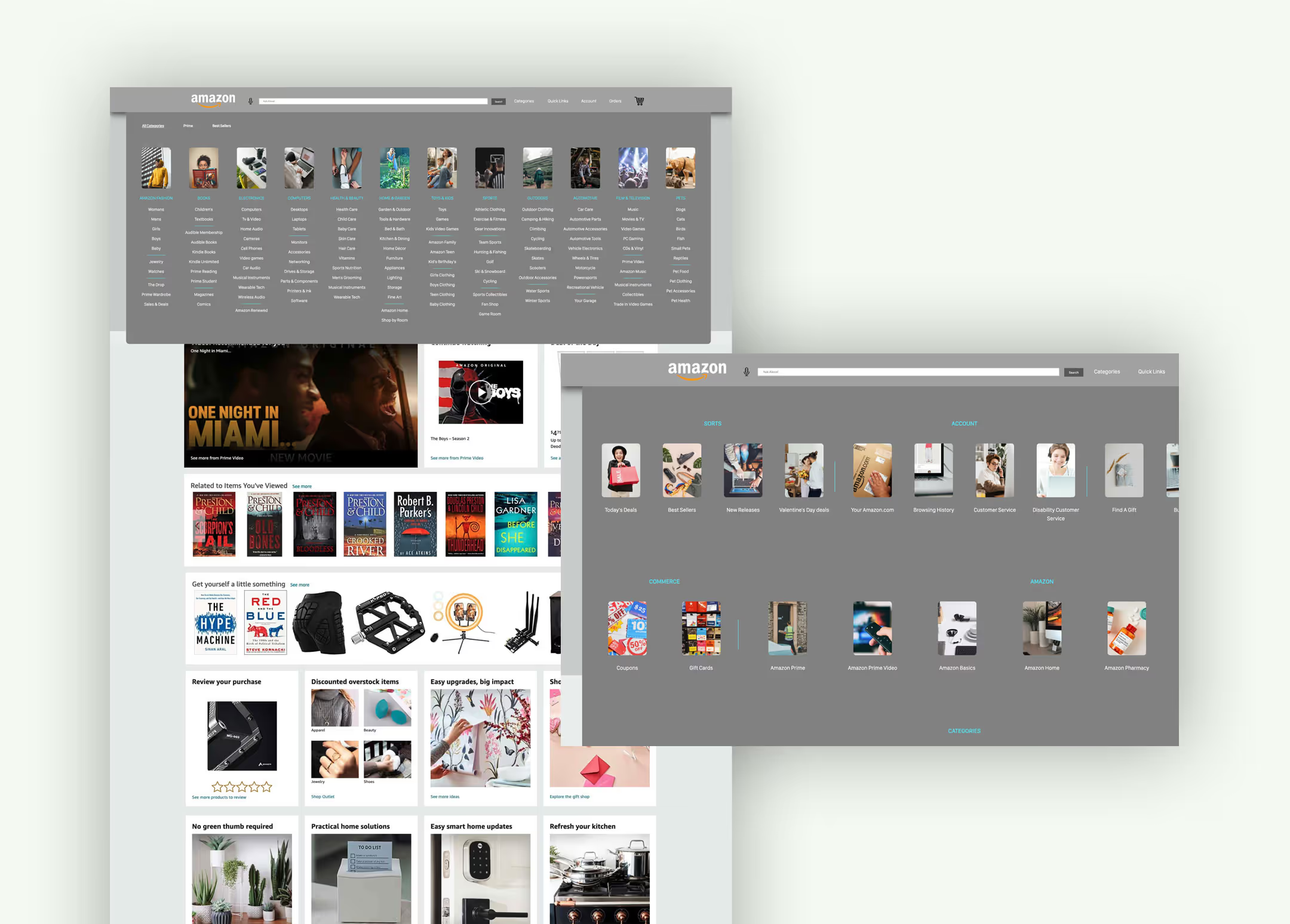
Placing these links as a global primary navigation mega menu would mean they are removed from the initial step of the users gulf of evaluation.

Revised discovery userflow

Revised Amazon browse workflow
prototype

Having identified the behaviour in need of support, the problem users are having, and the cognitive principles at issue I was prepared to prototype a solution

The revised menu, with annotations

Reflections & takeaways

It was surprising to see how often users experience moments of deprecated self-confidence when shopping Amazon. Given the importance of competence as a component of positive moments, it seems like a terrible oversight by Amazon. It was also eye-opening to see just how many times users repeated their searches. Some returned to the Omni bar to recover from navigating someplace they had not expected, and others returned to enter different search queries.

These are common and thoroughly understood problems users face when searching. While search is good for finding something specific when there are too many items to browse in a timely manner, without sophisticated architecture for browsing categories of items, users miss out on the rich and entertaining experience of potentially learning about items they had not considered.

In a culture practically anchored in shopping as a form of entertainment, there must be some reason why the architecture is forcing searches over browsing. It could be that all of the user data generated by users entering queries serve some practical value that translates into profit for Amazon. Without looking under the hood, it is impossible to say. It is safe to say that there is no shortage of talent on the UX team at Amazon, and if they wanted to facilitate faceted search and browsing from a mega menu, they would.